You're spending ₹2,00,000 per month driving traffic to your website. Your analytics show 50,000 monthly visitors. But your sales dashboard is flat. Your lead form sits there collecting dust. Your phone isn't ringing.
The problem isn't traffic. It's what happens after the click. Conversion rate optimization is the highest-ROI activity in digital marketing because it multiplies the value of every rupee you're already spending on traffic. Doubling your conversion rate has the exact same revenue impact as doubling your ad budget — but at zero additional cost.
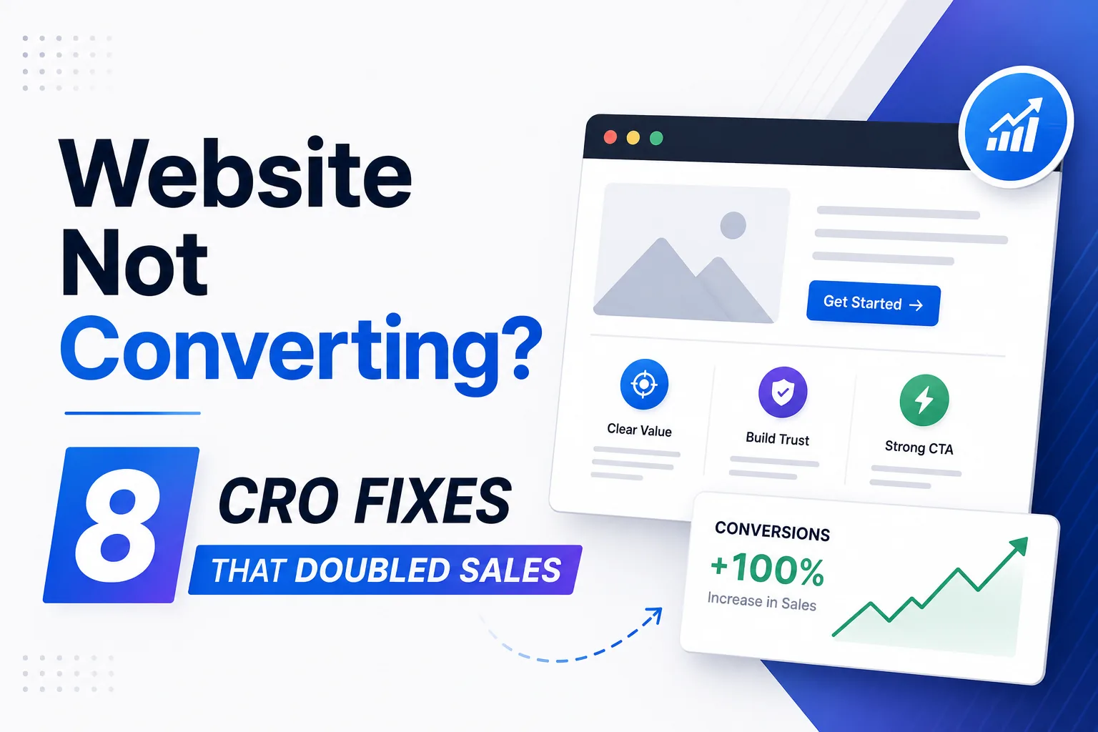
After auditing 150+ Indian business websites across ecommerce, SaaS, education, and services, we've identified the 8 conversion killers that appear in over 80% of underperforming sites. Businesses working with a Performance Marketing team that prioritizes CRO often see significantly higher ROI from the same traffic spend. Here are the exact fixes — each with implementation steps and the conversion lift you can expect.
📊 A 1% improvement in conversion rate on a site doing ₹10L/month in revenue means an extra ₹1,00,000+ per month — from the same traffic you're already paying for.
📊 Want a free CRO audit? DigiVeritaz identifies conversion leaks in 48 hours. Book your audit
1. Fix Your Page Speed: The 3-Second Rule That Costs You Half Your Traffic
53% of mobile visitors abandon a page that takes longer than 3 seconds to load. On Indian 4G networks — the connection most of your actual customers use — the average website loads in 5–8 seconds. This means you're losing more than half your paid traffic before visitors even see your offer.
Run your site through Google PageSpeed Insights right now. Then prioritize these fixes in order:
- Compress all images to WebP format (saves 25–40% file size)
- Enable lazy loading for images below the fold
- Minify CSS and JavaScript files
- Upgrade to a better hosting plan (shared hosting in India is painfully slow)
- Implement a CDN with Indian edge servers for faster delivery to Tier-2 and Tier-3 cities
Many brands investing in Landing Page Design improvements start by optimizing page speed because even small delays drastically impact conversions.
💡 Pro Tip: Test page speed on a real 4G connection from a Tier-2 city, not your office Jio Fiber. The real-world experience for your average Indian customer is typically 2–3x slower than what you see in your Airtel Xstream-connected workspace. Use WebPageTest.org with a Mumbai or Bangalore server for accurate results.
2. Rewrite Your Above-the-Fold Content (The 5-Second Test)
Visitors decide within 5 seconds whether to stay or leave your website. Your above-the-fold section must instantly answer three questions: What is this? What's in it for me? What should I do next?
If your hero section shows a generic stock photo of "people in a meeting" and a vague tagline like "Innovative Solutions for Your Business," you're bleeding conversions. Replace vague headlines with specific outcome statements. "We help D2C brands scale from ₹3L to ₹30L/month ad spend at 4x+ ROAS" beats "Results-Driven Digital Marketing Agency" every time. Specificity creates credibility.
Strong messaging is a core part of successful Conversion Rate Optimisation because clarity directly impacts user action.
💡 Pro Tip: Run the "Grandmother Test": show your homepage to someone completely unfamiliar with your industry for exactly 5 seconds. Then hide it. If they can't tell you what you do and why they should care, rewrite immediately. This simple test reveals more than any analytics dashboard.
3. Move Social Proof Above the Fold (Stop Burying Your Best Asset)
Testimonials, client logos, review counts, star ratings, and trust badges placed above the fold increase conversion rates by 15–30%. Yet most websites bury social proof in a "Testimonials" section at the bottom that 80% of visitors never scroll to.
Move your strongest proof element immediately below your headline. This could be a star rating with review count ("4.8/5 from 200+ reviews"), a client count ("Trusted by 60+ Indian brands"), a result metric ("1,15,000+ qualified leads delivered"), or a recognizable client logo bar. The proof should be visible without scrolling on both desktop and mobile.
This type of trust-building strategy is commonly used in high-performing Landing Page Design projects to improve visitor confidence instantly.
💡 Pro Tip: Use specific numbers, not vague claims. "60+ brands trust us" outperforms "Trusted by many." "4.8/5 from 200+ verified reviews" outperforms "Highly rated." Specificity activates trust circuits in the brain that vague language bypasses entirely.
4. Reduce Form Fields to the Absolute Minimum (The 2-Field Rule)
Every additional form field reduces completion rates by 5–10%. If your lead form asks for name, email, phone, company name, designation, city, budget range, and a detailed message — you're losing 60%+ of potential leads at the form itself.
For the initial contact, you need exactly two things: name and phone number (or email). Everything else can be collected on the follow-up call. In Indian markets specifically, phone number converts better than email as the primary field because WhatsApp follow-up is immediate and personal.
Test a 2-field form (name + phone) against your current multi-field form. We've seen conversion lifts of 80–120% from this single change across service businesses.
Simplifying forms is one of the quickest wins in Conversion Rate Optimisation for lead generation websites.
💡 Pro Tip: Add a single qualifying question as a dropdown if you absolutely must filter leads: "What's your monthly marketing budget?" with ranges. This adds minimal friction while helping your sales team prioritize follow-up. But never make it required — always let people submit without answering.
5. Install Heatmaps and Watch 50 Real User Sessions
You think you know how visitors use your website. After watching 50 real session recordings, you'll discover you were wrong about almost everything. Install Hotjar (freemium) or Microsoft Clarity (completely free) and record actual user behavior. You'll find:
- Buttons that look clickable but nobody clicks
- Content sections that nobody reads (despite you spending hours writing them)
- Forms that people abandon halfway through
- Mobile issues you never knew existed (because you only test on your iPhone 15 while most users are on budget Android devices)
- Rage clicks — spots where frustrated users click repeatedly because something isn't working
This 2-hour exercise of watching real sessions reveals more actionable conversion insights than months of guessing and A/B testing random elements.
Companies using Data Strategy Consulting often rely on behavioral analytics like heatmaps and session recordings to uncover hidden conversion bottlenecks.
💡 Pro Tip: Pay special attention to mobile sessions from Android devices. 70%+ of Indian web traffic is mobile, and budget Android phones render websites differently than your flagship device. The most common mobile CRO issues are: tap targets too small (fingers are bigger than cursors), horizontal scrolling on tables, and sticky navigation headers that consume 30% of precious screen real estate.
6. Create Dedicated Landing Pages for Every Campaign (Stop Sending Traffic to Your Homepage)
Sending ad traffic to your homepage is the single most expensive mistake in digital marketing. Your homepage serves 10+ audiences with 10+ messages. A dedicated landing page serves one audience with one message and one clear action.
Build a unique landing page for each ad campaign, each target audience, and each specific offer. Each page should have:
- One clear headline matching the ad copy exactly (message match)
- One offer
- One target audience's pain point addressed
- Social proof relevant to that audience
- One single CTA
- Zero navigation menus (remove all menus to prevent exit leaks)
This single change of creating dedicated landing pages typically lifts conversion rates by 25–50% compared to homepage traffic.
High-converting Landing Page Design focuses on eliminating distractions and keeping users focused on one action.
💡 Pro Tip: The critical element is message match. If your ad says "Get 10X ROAS on Meta Ads," your landing page headline must say "Get 10X ROAS on Meta Ads" — not "Welcome to Our Agency." The visitor clicked because of a specific promise. The landing page must deliver on that exact promise immediately.
7. Add a Sticky CTA Bar on Mobile (The Always-Visible Action Button)
On mobile, users scroll extensively through your content. By the time they're convinced and ready to take action, the CTA button is 4 screens above them. They'd have to scroll all the way back up to find it. Most don't bother.
A sticky bottom bar with your primary CTA ("Call Now," "Get Free Quote," "Book Free Audit") keeps the action button permanently visible regardless of scroll position. Sites implementing sticky CTAs on mobile consistently see 20–40% higher conversion rates. The bar should be slim (not blocking content), use a contrasting color from your navigation, and contain action-oriented text.
Mobile-first thinking is essential in modern Conversion Rate Optimisation strategies because most Indian traffic comes from smartphones.
💡 Pro Tip: Make the sticky CTA a distinctly different color from your navigation bar. Visual contrast catches attention and signals "this is the thing to click." Use action verbs: "Get My Free Audit" outperforms "Contact Us" by 30–40% on click-through rate because it's specific about what the visitor receives.
8. A/B Test Headlines Before Anything Else (The 80/20 Rule of CRO)
Headlines impact conversion rates more than any other single element on your page. More than button colors. More than images. More than layout. Before testing anything else, test 3–5 headline variations on your highest-traffic page.
Use outcome-focused headlines ("Double Your Leads in 90 Days") against process-focused headlines ("Expert Digital Marketing Services"). Test specific numbers ("4x–10x ROI") against vague claims ("Exceptional Results"). Test question headlines ("Still Struggling with Low ROAS?") against statement headlines ("We Fix Low ROAS").
Use Google Optimize (free), VWO, or Optimizely. Run each test for at least 2 full weeks or 1,000 visitors per variation, whichever comes last, to reach statistical significance.
A data-driven Performance Marketing strategy depends heavily on continuous testing and optimization to improve ROI over time.
💡 Pro Tip: Test outcome headlines against process headlines first. "Double Your Leads in 90 Days" vs "Professional Lead Generation Services." In our tests across 40+ Indian business websites, outcome headlines win 70% of the time across all industries. People buy results, not processes.
Frequently Asked Questions
What is a good conversion rate for Indian websites?
Average conversion rates in India: 1–2% for ecommerce, 3–5% for lead generation pages, 5–10% for SaaS free trials. Top-performing sites achieve 2–3x these benchmarks through systematic CRO. If you're below these averages, there's significant room for improvement.
Should I focus on traffic or conversions first?
Fix conversions first, always. Doubling your conversion rate has the exact same revenue impact as doubling your traffic — at zero additional ad spend. Optimize the funnel before pouring more budget into the top. Many businesses improve profitability faster by combining CRO with a structured Performance Marketing approach instead of focusing only on traffic acquisition.
What is the easiest CRO win for most websites?
Reducing form fields (to 2–3 max) and improving mobile page speed are the two highest-impact, lowest-effort CRO fixes. Most sites see 20–40% conversion lifts from these two changes alone, often within the first week.
How long should I run an A/B test?
Run tests for at least 2 full weeks (to account for day-of-week variation) AND until each variation reaches at least 1,000 visitors. Ending tests early leads to statistically unreliable conclusions that can actually hurt performance.
How much does professional CRO cost?
Basic CRO (heatmaps, form optimization, speed fixes) can be done with free tools. Professional CRO audit and testing programs cost ₹30,000–₹1,50,000/month depending on traffic volume, test complexity, and number of pages optimized.